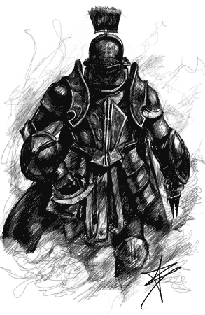
Hello everyone. Sorry if this has been discussed before, but Google has spoilt me with excellent search, which MediaWiki is not blessed with. I think talk bubbles can potentially make discussions much more readable, because MediaWiki's constant indenting and easily missable signature makes identifying users rather hard. They allow insane customization, which eliminates the identification problem. Talk bubbles become a shot in the foot when users start employing unreadable fonts and color schemes. Even if the fonts are readable, it's harder for the brain to decipher text when it has to jump from one font to another [citation needed]. I've seen beautiful but unreadable cursive fonts and combinations of background color and text color. Imagine when an entire discussion page is full of contrasting background colors and fonts. I think my brain just shuts down and wish CSS was never developed. This is a real shame because talk bubbles are supposed to make discussion pages more readable, not less. TacticAngel's example talk bubble demonstrates this beautifully. However, I have an issue with the double line on top containing not much more than the name and date taking up space, especially noticable on single-line replies. So I believe the talk bubbles could stand to be made a whole lot more readable, while still allowing customization. I'm not presenting my ideas yet because I think there are many ways to go about this. On a side note, I just discovered that talk bubbles choke on single square bracket external links with link text (i.e. [http://en.wikipedia.org/wiki/Wikipedia:Citation_needed|citation needed], probably due to the pipe symbol (vertical line). One day, when my wiki-fu is strong enough, I'll find out how... | |||

Well, for your sidenote, the notation is wrong. You don't type the pipe symbol when liking to external websites. You just have a space between the URL and the link text like this: [http://en.wikipedia.org/wiki/Wikipedia:Citation_needed citation needed], or, as it is a wikipedia link, [[Wikipedia:Wikipedia:Citation needed|Citatation needed]] is all that's required. When you do need a pipe inside a template, without manipulating the contents of the template, type {{!}}. Back to your point on talk bubbles. You are right. It's very similar to my recent plea to make signatures readable. Talk bubbles should be readable too. I, for example, have chosen to have a relatively simple template: a light colour background and a dark colour font, and a readable typeface. I've actually asked people in the past to change their talk bubble settings because the colours clash and I couldn't read what they've typed. Tactic Angel's bubble isn't really a good example of a good talk bubble though, as the image height exceeds the minimum height of the bubble, which is against wiki policy. It's just that that rule is never enforced, and many people contravene it. | |||
There is a fix for the height rule, it's just not in place because it usually stretches the top-field, not the bottom-onbe. I could probably fix it by adding a height="100%" to the field the text is used in, this means if the image is too tall, the text-field will stretch to match it.
I was recently talking about fairuse, and I thought a brilliant idea would be to make it automatically use the user's personal avatar. But there's no way to display an avatar, since Wiki controls it magically, the URLs are random and therefore there's no place where just switching the username makes it work. If it was possible, it would be the best thing ever.
D: 88.108.91.203 22:32, July 28, 2010 (UTC)
D'oh at my syntax error. Thanks Jeppo. I overlooked TacticAngel's image height, I guess what's demonstrated is the readability. What are everyone's suggestions? I'm sure there are ways around this.
| |||
SilverCrono — 22:49, July 28, 2010 (UTC) "Why is the sea salty? Probably because you folks use it as a toilet!" | |||
I don't think my bubble is too bad, but.. I have seen some bad bubbles. | |||
Okay, first, no font customisation or colour customisation means talkbubbles like Jeppo's will look awful. Name and date changed to one line means we'll have to remove the signature function, or monitor it so the longest timestamp possible, plus their name, and their signature doesn't extend to two lines on even the smallest screen resolutions. Unless we allow it to stretch to two lines, but the entire thing will look too compact.
We do have means to resize an image to a certain height. What we cannot do is then re-add the lost pixels to the left-margin. Which means the margin won't stay the same size, which looks bad. The only thing we have left after that is to remove images from users that are too tall. Many of these changes would require further monitoring. Currently the monitoring only extends to "make sure {{{time}}} is there and make sure image is not bigger or smaller than 60px width"JBed 23:05, July 28, 2010 (UTC)
I'm not crazy with enforcing new policies or anything. I think all we can do is use our common sense and ask users nicely to change their bubbles if it is unreadable. | |||

Truthfully, I think this entire thing is unnecessary. There is no need for any other Talk Bubble regulations than the ones we have just now. The ones you've suggested are basically stripping all bubbles of originality and customization. I understood the issue with signatures, but with Talk Bubbles? No. Re-size the image if you must, whatever. But the chat on the signature page was concern about "regulations for the sake of regulations". If the colours in someone's talk bubble hurt your eyes, just ask them to change it. They normally will. I am yet to come across a Talk Bubble I cannot read. Besides, Talk Bubbles are used mostly on the Forums and the Talk pages. It's not like anything of extreme and utmost importance is being said within them - users normally just use plain text on the Mainspace and use the newly regulated sigs. | |||

If you are asking us to all change our talk bubbles to black and white, then no. The customization of each talk bubble is what helps identify each user, and by implementing your suggestions I believe you'd actually be making the "problem" a lot worse. | |||
You misunderstand DSS, he's talking about changing the talk bubble's "text" field (the middle section, or the bottom section depending on if you use color3) to black and white. I could change everyone's to those colours in one edit.
Also, DSS, your talkbubble is one of the offending talkbubbles. that purple on the black is an eye-strain to read. Also, MC's could very easily be considered an offending talkbubble. JBed 23:39, July 28, 2010 (UTC)
- It must be your own eyes, then. I haven't a problem reading it and I haven't recieved any complaints about it since I changed it the last time. - +DeadlySlashSword+ 00:52, July 29, 2010 (UTC)
So he would change it. No big deal, not deserving of a new policy. | |||
Template:HenryA
No worries mates, forget my suggestions. I was just throwing them out there. The idea was for everyone to make suggestions, but I see now that making suggestions is premature. I'm not suggesting rules. I'll now go back to proposing that talk bubbles could be more readable, and we can do something to make them more readable, without sacrificing customization. How we go about that is something we'll address later. Currently, there's a potential for them to get out of hand. To handle that, users are asked to change their bubbles. Drawback: requires manual intervention and work. Users may refuse to change their bubbles. What if tons of users have unreadable bubbles? I'm thinking long term here. If there's an influx of bubbles, every single user will have to be asked to change. And they may not change. I'm not talking about individual bubbles, I'm talking about entire discussion pages and also the fact that every single instance of an unreadable bubble has to be actively addressed. There has to be a better way to go about this. I don't know how, but that's why I made this thread. I'm sure everyone has ideas on how to make all bubbles and discussion pages more readable. I believe it's worth minimizing the active effort required. It means more effort can go into the articles themselves. Deadlyslashsword, I agree with JBed. | |||

8bit BlackMage - Beyond the Sky TALK - Why do chemists call helium, curium, and barium 'the medical elements'? Because, if you can't 'helium' or 'curium', you... um... ._.; - 02:26, July 29, 2010 (UTC) | |||
If someone has an unreadable bubble, we ask them to change the bubble. That it really all we can do. Image size is easily monitored by removing the image from the template and replacing it with the wiki logo image. Text color can easily be monitored by changing the font in the template. Staff members have certainly exercised this ability in the past. | |||
I think if it is rendered unreadable or results in headaches, it should be changed. It's a reasonable regulation to keep the wiki running so I support it. Exdeath64 02:43, July 29, 2010 (UTC)
|
| |||||||||||||||||||||||||||||||||||||||||||||||||||||||||||||||||||||||||||||||||||||||||||||||||||||||||||||||||||||||||||||||||||||||||||||||||||||||||||||||||||||||||||||||||||||||||||||||||||||||||||||||||

I think mine is readable, but I get the idea. It annoys me when people deliberately use similar color backgrounds and text, making it a headache to read, | |||
The main reason for this thread is that I believe FFWiki will benefit from readable talk bubbles. That readable text bubbles would make FFWiki a better place, where everyone can read everyone's talk bubbles easily. Doing this doesn't have to involve rules, and it won't affect customization. I don't know how this will be accomplished, but I believe we can figure out a way to do it. I think everyone can agree that easy reading would be great. Thanks so much for responding, guys, you're all too awesome. Man, this place moves fast. On behalf of everyone, thanks for changing your talk bubble, Deadlyslashsword. Really considerate. And I'm just in love with TacticAngel's single line date / name. It's so space efficient. For those interested, I tried CSS to see if I could come up with a client-side preference. Unfortunately, the HTML isn't easy to work with. Hm. | |||
Now we arrive at the slightly more serious problem: identity. Just like with signatures, I need to know, from a glance, who has written that message. Take the bubble two posts up from me. Is that written by a person with the username of "Black Mage Jeff"? No, it's written by somebody with the username of SSFF6B. See my point? Just like before, I believe that instead of adding yet more new regulations, just asking people to change their bubble so that it clearly displays their username is fine. | |||
Once again I'm not saying more regulations is the way to go. There are plenty of ways to do it. If no one wants regulations, then don't do regulations. Wouldn't it be great if talk bubbles were automatically generated for each user? How come it's possible to replace the username with something else anyway? If MediaWiki had proper discussion pages we wouldn't even be having this conversation. But short of committing code to MediaWiki I think that's not in our hands. Asking people to change things requires active effort, and in the long run, pulls manpower away from the actual content. If there were an automated way of ensuring names matched usernames, no one would have to lift a finger, and everyone would be able to concentrate on making the articles better. Think about it: how come forums (eg phpBB) allow easy identification? | |||
@Jeppo: That's the "nick" function. This can be fixed by either removing it, or, before the time field, we could add '{{#if:{{{nick|}}}|{{{name}}} |}}, this means if they have decided to use (and abuse, since "nick" is so users like "Yuanchosaan" could call themself "Yuan") their username is still displayed. JBed 09:54, July 29, 2010 (UTC)
I might suggest, if we did anything, that we ask for some consistency in terms of color use. I don't think everyone should be forced to use black on white, though it is clearly the most tasteful method of displaying your talk bubble. What might make sense is a 'pastel' rule. This is easily quantifiable in terms of hexadecimal math. You could say no signature should have a total RGB value of less than 672, say. That would be a tone no darker than
| E0E0E0 |
. Maybe you want your text to be in front of redish stuff, so you could go with
| FFD2D2 |
. Similiarly, you would probably limit the color of any text in the main field to being less than 60, creating an average of
| 202020 |
, here displayed atop grey to show this is still sufficient contrast to read. Once again, you could still customize, maybe put a dark blue on a light blue as so
| 000060 |
, but you couldn't completely render your template garbage. In any case, this sort of thing at least would be at least mathematically consistent, and not give rise to random 'enforcement'. T·A·C·T·I·C·A·N·G·E·L 22:34, July 29, 2010 (UTC)